Feel free to leave a comment, no matter how nasty it is
Cheers,
Owen.
A discussion forum - and more - for users of Digital Single Lens Reflex cameras.
Creek images take 2 - now with added gumboots!Moderators: Greg B, Nnnnsic, Geoff, Glen, gstark, Moderators
Forum rules
Please note that image critiquing is a matter of give and take: if you post images for critique, and you then expect to receive criticism, then it is also reasonable, fair and appropriate that, in return, you post your critique of the images of other members here as a matter of courtesy. So please do offer your critique of the images of others; your opinion is important, and will help everyone here enjoy their visit to far greater extent. Also please note that, unless you state something to the contrary, other members might attempt to repost your image with their own post processing applied. We see this as an acceptable form of critique, but should you prefer that others not modify your work, this is perfectly ok, and you should state this, either within your post, or within your signature. Images posted here should conform with the general forum guidelines. Image sizes should not exceed 950 pixels along the largest side (height or width) and typically no more than four images per post or thread. Please also ensure that you have a meaningful location included in your profile. Please refer to the FAQ for details of what "meaningful" is.
Previous topic • Next topic
4 posts
• Page 1 of 1
Creek images take 2 - now with added gumboots!
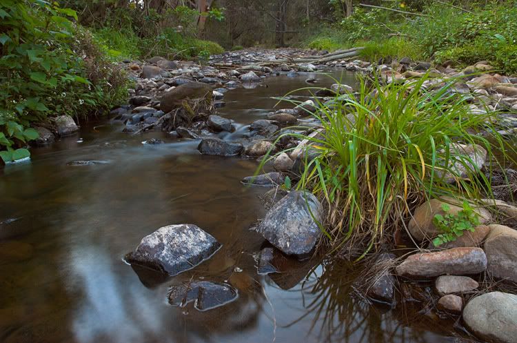
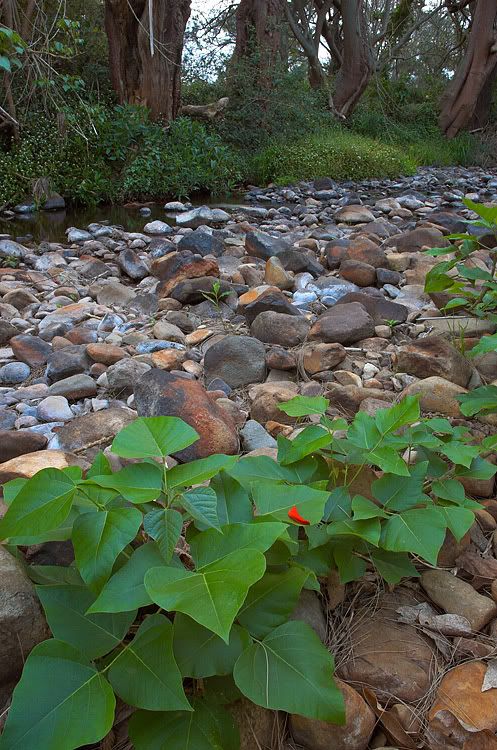
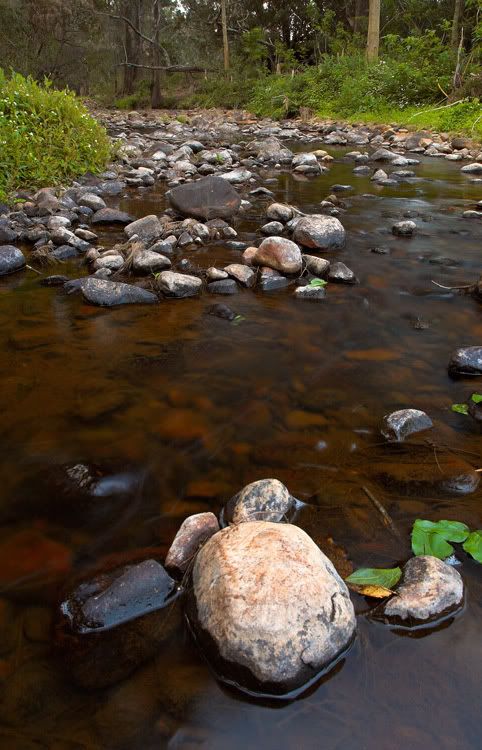
Hey fellas, went back to the dreaded creek today but this time I had a secret weapon - some gumboots from bunnings! After reviewing these images I thought I could have done better, but I'll share them anyway.
Feel free to leave a comment, no matter how nasty it is Cheers, Owen.
Hi Owen,
I like the 2nd photo. The focus starts at the front, then slowly fades as the scene continues into the distance. The composition is also in tune with the focus, it follows. regards, Christian
OK - first, let me say the colours you have here are AMAZING!!!
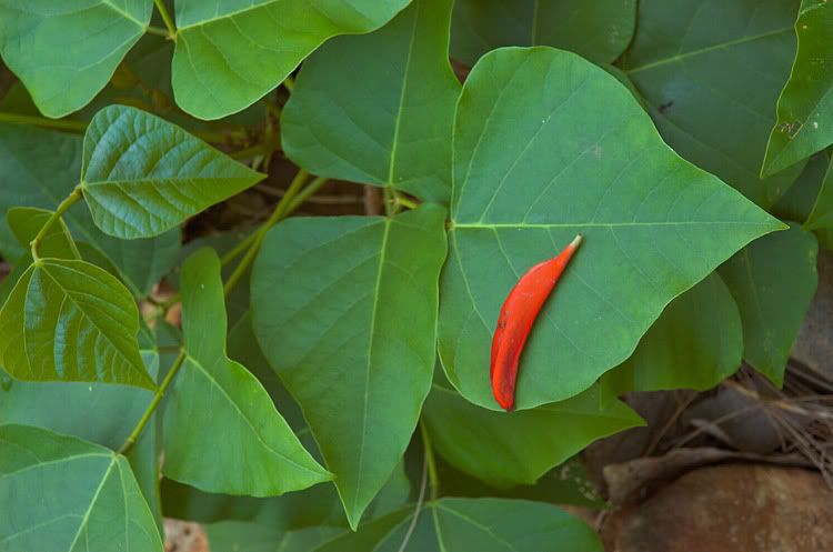
With that out of the way... 1. I really like this, but I think what lets it down a little is the highlights in the water at the bottom. Not sure what you could do about them - maybe some local treatment with a dodge tool perhaps? The other thing you could do would be crop it just below the big clump of grass - just b4 the bright rock comes into view. 2. I think would benefit from a crop at the top, so the sky behind treeline is left out. Personally I would also have got rid of the red leaf. 3. Works better without the foreground - it's a little bare, and you appear to loose the sharpness in the closest rocks 4. LOVE the clarity and colour on this - really nice What are you doing with the colours? Because it is working amazing things Hope all that helps - remember it's just my opinion, which in the end may not count for much *** When getting there is half the fun! ***
Thanks for the comments Christian and Sheepie.
I took several shots with the polariser on the camera, but in the first image it wasn't polarising, I took one with the reflection reduced and that looks okay, except you lose the movement in the water so I didn't think it was as interesting. I didn't try a half-polarised shot, I should have! Doh! With the colours to be honest the images out of the cam have been really flat and dull lately, I may have to have a fiddle with the settings a bit more. In PP I have been using the Velvia Vision plugin, it seems to do a little bit more than a saturation boost and is quite effective. However, it can't fix composition so I'll have to get out and take more shots! Thanks for taking the time to comment. Cheers, Owen.
Previous topic • Next topic
4 posts
• Page 1 of 1
|


