Cheers,
Owen.
A discussion forum - and more - for users of Digital Single Lens Reflex cameras.
A Cat named Bruce.Moderators: Greg B, Nnnnsic, Geoff, Glen, gstark, Moderators
Forum rules
Please note that image critiquing is a matter of give and take: if you post images for critique, and you then expect to receive criticism, then it is also reasonable, fair and appropriate that, in return, you post your critique of the images of other members here as a matter of courtesy. So please do offer your critique of the images of others; your opinion is important, and will help everyone here enjoy their visit to far greater extent. Also please note that, unless you state something to the contrary, other members might attempt to repost your image with their own post processing applied. We see this as an acceptable form of critique, but should you prefer that others not modify your work, this is perfectly ok, and you should state this, either within your post, or within your signature. Images posted here should conform with the general forum guidelines. Image sizes should not exceed 950 pixels along the largest side (height or width) and typically no more than four images per post or thread. Please also ensure that you have a meaningful location included in your profile. Please refer to the FAQ for details of what "meaningful" is.
Previous topic • Next topic
12 posts
• Page 1 of 1
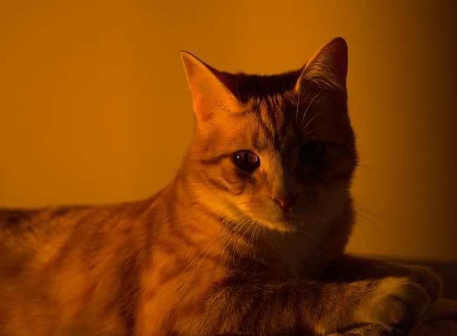
A Cat named Bruce.
Here's one of our cats, bathed in the afternoon glow that was lighting up our loungeroom.
Cheers, Owen.
Owen,
I have to say I'm not a cat person, but this is a gorgeous portrait. Lovely light that suits the subject and the eye is nice and sharp. Well done!
Owen
I AM a cat person, but I have to say this is WAY too orange. It looks almost monochromatic. Try dialing this down a little. Remember the D70 has a penchant for red so you'll gte more orange than the eye sees. The warm glow is fantastic, but we need to see some of the colours of your lovely cat too. Peter
Disclaimer: I know nothing about anything. *** smugmug galleries: http://www.stubbsy.smugmug.com ***
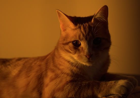
How's this stubbsy? The colour in the first one is how the camera recorded it. I wasn't aware that the D70 saturates the red channel moreso than others, but I know now. Thanks mate, Owen.
Great capture. The catch highlight in the eye does it for me. I think it enhances the effect of the sharp point at the cats eye and then the soft light makes the fur soft and almost silky looking.
I don't mind either version but would be interested to see what photoshop would do if you used the auto colour function Craig
I dont know if its the size difference between the 1st image and the 2nd image posted.. and the slight colour difference... but i prefer the 1st one.. dont know why.. im not a cat person.. ive got a "Looking for your cat? check under my tyres" sticker on my car.. but that is a top photo.. i will admit ive got a cat.. and he is the hardest thing to photograph.. he insists on putting himself in places with extremely distracting backgrounds.. and its hard to work with him.. he's not very people friendly unless youve got fresh fish... but i do like your image, its nice..
Tim D70 - D200/MBD200 Coming soon - Too Much Gear, Not Enough Talent
My Site: http://www.digitalstill.net My Fishing Site: http://www.fishseq.com
Hi Jordan.
I just tried the auto colour and it turned his ear into a mass of orange... it's like a blown highlight only orange. Otherwise it just dulled the orange, much like my second attempt. Thanks for the suggestion though. Cheers, Owen.
Yeah I though it wouldn't cope but was interested on how it would try and resolve the colours. Is the light coming through a stained glass window or something with a tint? very cool shot. Craig
Owen, I'd like to make a suggestion. The orange wall and the orange cat make the shot look very, aah, orange. It would be interesting to desaturate a lot of the orange out of the wall (so it's almost monochrome) and pump the mid tone contrast (of the cat) up a bit in shadow/highlight. You'd have to watch it a bit with the mid tone contrast as it'll cause a sharpened effect and it might make the fur look a bit crunchy. It won't be an easy couple clicks getting the selection right but might be worth the trouble.
I tried a similar effect on an image of a couple green lizards that were bathed in green light at the reptile house at the zoo. When I started it just looked far too green, but when I finished it looked a whole lot better (I even pumped the green in the lizards up a bit). Nice cat BTW. D3, D300, 14-24/2.8, 24-70/2.8, 85/1.4, 80-400VR, 18-200VR, 105/2.8 VR macro, Sigma 150/2.8 macro
http://www.johndarguephotography.com/
Thanks for the comments again guys.
As mentioned the orange light is just how the evening light was. The wall is actually a pale cream colour too, and the light is just coming through a normal window. It was only moments before sunset though, which is when it's the warmest it gets. I'll try what you suggested John. Cheers, Owen.
Owen
It's a tough call isn't it. A little like sunset pics. How much orange is natural. For me I do prefer the second version, but I'd be interested to see the outcome if you have the time and inclination to follow John's suggestion. Peter
Disclaimer: I know nothing about anything. *** smugmug galleries: http://www.stubbsy.smugmug.com ***
Previous topic • Next topic
12 posts
• Page 1 of 1
|


